Have you ever visited a website via their social channels and wondered oh how beautifully they’ve created social media images and the site itself? I often do, and I stick around looking and reading more posts – with the thought that I would implement the same to mine – a sort of site branding. One look and you see the colors synchronized, fonts matching the layout, not competing against each other, overall making it easy to read and understand.
Time and again, we are reminded that when creating a website, one should make sure that the design is for the audience. Simply put, beauty is in the eyes of the audience, the functionality of a site is determined by their experiences.
Elements that make or break the overall look of a website include usability, speed, content, availability, and aesthetics. But let’s focus on the last one for this post: aesthetics. That would include the following factors or elements: colors, typography and fonts, images, alignment, and even white spaces. And let’s touch on images, which if we would break down to the tiniest details would still include the elements mentioned above.
So what defines effective social media images? They should be images that move audiences’ emotions that they share, click on, thus, converting your images to traffic or sales. Here are 5 elements you should look into to create effective social media images in general: considering the platform, they would live in that includes Facebook, Pinterest, and Instagram.
Table of Contents
1. Colors
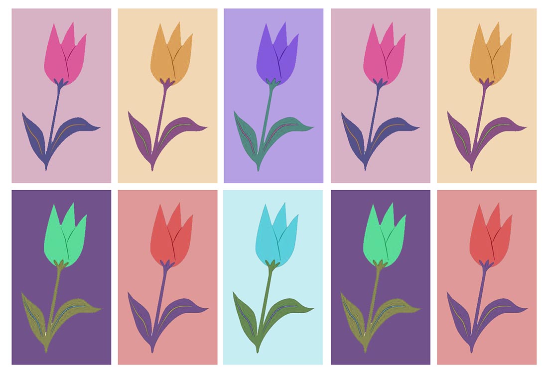
Colors appeal to us as visual creatures, we like things that are pretty. Colors attract us first when looking at an image.
Platform
Consider the platform your image would be placed at, though they are following the context of your brand, it needs to be in harmony with where it will stay for its life. For Facebook, images with blue and white would just blend in and not be noticed, being these are Facebook’s brand colors. Use bright hues to make your image stand out, but if you have blue as a brand, include it just make sure that there are enough other color combos to make your image pop.
Harmony
Colors need to complement each other, if your website has particular colors, splash them in your images as well. According to a study, the most shareable images contain red, pink, and purple in them.
Negative Space
As any other element is important in an image layout, negative space is too. Negative space allows the other components of your social media images to stand out. It also allows for a clutter-free look and reduces info overload. Our eyes can only take too much information, negative spaces give us a breathing room, sort of.
2. Font and Typeface
(Yes, those two are different). Let’s refer to both as part of typography, or the art of arranging text (physical and digital) to make reading language readable.
Now that there are a lot of fonts free to download, it could be confusing which to use for your site or images. If you are not well-versed in Webdesign and lack the budget to hire someone who would, you will find that a lot of resources are available for you. Fontbundles, for example, has a lot of free premium fonts ready for the download. Their mockups on-site will make you see how pretty each is.
Why Fonts Matter
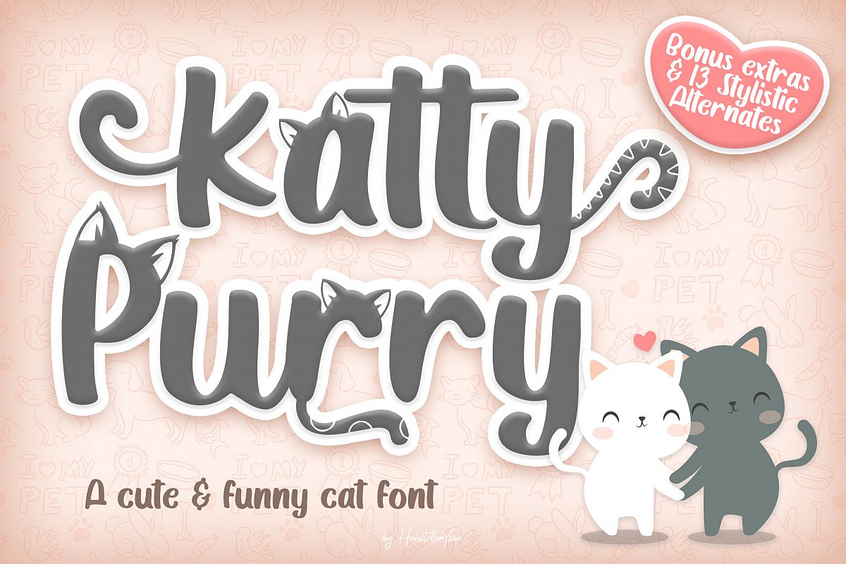
Fonts do not just transmit words, the font used will have a profound effect on a reader’s perception. If you want images to have a formal appeal, you use a serious-looking font and typeface like Belleza, Calibri, Cambria, Inria serif, Bodoni, the serif types. If you are aiming for a happy-themed image, using fun fonts like Boogaloo, Atma, Amsterdam, or the comic sans type are good. Take the Katy Purry font from above image, it’s fun and very well fits images with cats. You can combine fonts of course, but it would be nice to learn about font-pairing beforehand.
How Fonts Help Branding
Fonts grab audience attention too like colors. It would either make them stay and see more or just scroll past the image and your message as a whole. Fonts leave a lasting impression on those who see it. Whether you use elegant fonts, fancy fonts, calligraphic fonts, display fonts, it will create audience recall, they will remember where they saw such beautiful fonts, and recognize your brand easily.

3. Graphics
In principle, using your own is best when including a photo, a vector, or a screenshot if need be on the image you’re creating. Branding means such images are unique to you. Your goal is to create recognition of your brand. If you use photographs, either use products that you directly sell, if you are the brand, your well-thought-of photos would show authenticity. Stick to your color palette – your brand colors.
Let’s take the shirt image above. The fonts, color, and image on the first shirt go well together, I’d surely buy this for my kid. The gray one is also cute, although it’s just fancy fonts on it, I would love to wear it.
4. Emotions
If you combine all three elements above in your social media images properly, the right emotions would be conveyed. Bright colors shout astonishment, happiness, interest, marvel, and such, while dark colors can give out a feeling of despair.

5. Hashtags
What’s a hashtag? If you’ve been online for a decade then you know that it is the pound symbol on your keyboard, what’s also called an octothorpe. Nowadays, for people to find an item, they would look on social media for a hashtag with the keyword string like this: #socialmediaimages. Think of it as a way to compile images, articles, and other information across the internet with one click.
Befitting Social Media Images
Now that we’ve laid out the elements for effective social media images, it’s time to practice creating them for different platforms. Social media platforms differ, so what would be an effective image on Instagram may fail on Facebook.
|
|
|






Leave a Reply